
Tango Pools Journal
Pool Coping, Tile, and Patio Materials: Build One Coordinated Palette

Coping, waterline tile, interior finish, walls, steps, and patio materials are read together even when they are selected separately. A coordinated palette gives each surface a role and controls the transitions where colors, textures, joints, and edges meet.
Tango Pools’ custom gunite pools are designed with the surrounding poolscape in view. For an Oakland County home, existing architecture offers a useful starting point, but a successful palette does not require every new surface to imitate the house. This guide focuses on how to compare materials together and record decisions. Product suitability, installation details, and project-specific performance still need confirmation from the responsible professionals.
This guide connects Tango Pools’ custom gunite pools work with a specific task: coordinating coping, waterline tile, interior finish, walls, and patio materials.
Choose the architectural anchor
Brick, stone, siding, roof color, window trim, and existing terraces provide stronger starting cues than isolated pool trends.
Take photographs of the rear of the house in ordinary daylight. Include large areas of masonry or siding, window frames, roof edges, and any terrace that will remain. Then identify which of those elements has the strongest presence from the pool area. A material that seems minor at the front entrance may dominate the entire rear elevation. Starting with the actual view helps avoid choosing a pool palette that belongs to a different imagined house.
Choose a direction rather than chasing an exact match immediately. You might want the poolscape to sit quietly beside warm masonry or introduce a restrained contrast to darker window trim. Describe that intention in a sentence and use it to compare samples. A near-match that is slightly wrong can be more distracting than an intentional difference. Ask the designer to show how the main patio surface, water edge, and vertical walls support the architectural anchor without multiplying competing tones.
Identify the house material or tone that the new poolscape should support without copying every surface. Matching everything exactly can feel flat and may be impossible across different products.
Give every material a job
Coping defines the water edge, tile manages a visible transition, interior finish influences water color, and patio surfaces carry movement and furniture.
Think in areas and edges. The main patio may occupy the largest area, while the coping forms a continuous line around the water. Waterline tile is a smaller band, but contrast can give it a strong visual presence. A raised spa face or retaining wall adds a vertical surface that may be visible from across the yard. These different roles explain why a collection of individually attractive samples can still feel unsettled together.
Assign one or two materials a leading role and let the others support them. If a textured wall is intended to be the focal point, a quieter paving pattern may help it read clearly. If the water edge is the main detail, too many contrasting borders may weaken it. Review the combination at the scale of the property rather than giving every sample equal emphasis on a small board. The question is not how many beautiful products can fit, but what the eye should understand first.
Write one functional and visual purpose for each material before comparing colors. Adding a new material only for variety can fragment the design.
Study wet, dry, sun, and shade
Stone, pavers, tile, and interior finishes can change appearance with moisture, direct light, shadows, and reflected water.
When possible, look at samples outdoors beside the actual house materials. Observe them in direct light and shade, and ask the supplier or designer how to evaluate their wet appearance appropriately. Keep the samples in the same relative arrangement you expect in the project. Looking at one tile in the morning and an unrelated paver indoors at night makes comparison harder than it needs to be.
Use photographs as notes, not as the sole approval record. Screens, camera settings, and reflected light can change the way color appears. Water adds another variable: an interior finish should be discussed with the pool’s depth, surroundings, and lighting conditions in mind rather than selected from one image alone. Ask to see relevant examples while recognizing that another property will not reproduce your exact result. Record what you liked about a sample combination so later substitutions can be judged against an intention, not only a color name.
Review physical samples outside at different times and beside the relevant house materials when possible. Small indoor samples do not predict every outdoor condition.
Design the transitions
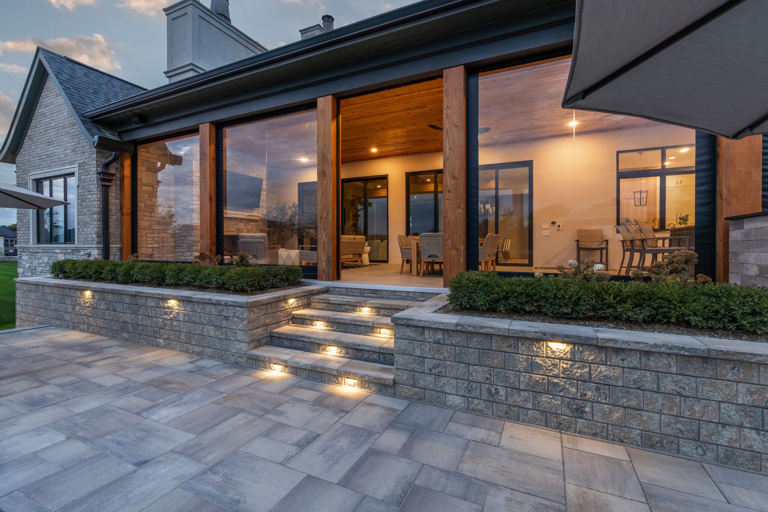
Coping-to-patio joints, step edges, wall caps, spa faces, drainage lines, and changes in paving direction determine whether the palette feels resolved.
The most revealing sample review often happens at a junction. Place the proposed coping beside the patio material and imagine the line continuing around the pool. Ask how joints, corners, changes in direction, and nearby drainage elements will be coordinated. A convincing palette needs a plan for these meetings, especially where different sizes or thicknesses are involved. The technical solution belongs to the installer and designer, but its visible result is worth reviewing.
Steps and wall caps deserve the same attention. Ask which edges should be emphasized and which should remain visually quiet. If the design changes material between two activity zones, locate that change deliberately rather than allowing it to fall at an awkward point in a walking route. Enlarged details or representative examples can make the discussion clearer. Do not approve a transition solely because both materials look good separately; ask how the finished intersection will be formed and how it relates to the surrounding layout.
Ask for enlarged details at the most visible or technically important junctions. Two attractive materials can still meet awkwardly without a planned edge.
Balance texture with comfort
Texture affects slip resistance, heat, cleaning, furniture stability, and the visual weight of large paved areas.
Describe where people will walk barefoot, move chairs, carry meals, or leave wet towels. Those uses create different questions for the same patio. A pronounced texture may look appealing in a close photograph yet need closer discussion beneath dining furniture. A surface that appears smooth may require particular attention to its intended wet-area application. Ask for product-specific information rather than relying on a broad category name such as stone or paver.
Discuss expected care as part of selection, including what the supplier recommends for the chosen finish and installation. The amount of visible variation, the treatment of joints, and the appearance of ordinary wear all influence long-term satisfaction. In Oakland County, exposure through the year belongs in that conversation, but no blog can certify a product for a particular site. Ask the team to connect its recommendation to the actual material and location. Comfort and maintenance should be considered alongside appearance before the palette becomes final.
Compare where bare feet, dining chairs, wet traffic, and winter exposure occur. No single surface performs identically in every location or condition.
Build and document one sample board
A useful board includes the proposed coping, tile, interior finish, main paving, wall material, and nearby house finish.
Build the approval record around exact selections and locations. Include manufacturer or supplier identification where applicable, product name, color, finish, size, and the part of the project where each item belongs. Add a dated photograph of the approved sample arrangement, while keeping physical samples when practical. This creates a much stronger reference than a message saying the light gray option looked best.
Ask how a proposed substitution will be reviewed if availability changes. A replacement may be close in color while differing in format, edge profile, or texture, which can affect adjacent details. Revisit the relevant combination rather than approving the substitute in isolation. Also distinguish normal variation within a material from an intentional change in selection. Tango’s related coping and poolscape resources can prepare you for the discussion; the final board and drawing notes should describe the particular palette agreed for your property and the transitions that make it coherent.
Photograph approved combinations and record exact product, color, finish, and intended location. Verbal color names are not enough to control substitutions or future decisions.
Continue this review with natural stone coping and hardscape materials and coordinated poolscape design.
Approve the complete palette, not isolated samples
Material coordination works best when the palette is small enough to understand and broad enough to support the whole property. Compare real samples together, document transition details, and let architecture and daily use guide the final hierarchy.
For a project-specific conversation, contact Tango Pools in Rochester. Bring photographs of the house materials, your preferred sample combinations, and the visible junctions you want the design team to explain. These starting points help the team connect the design discussion to the way you intend to use your property.